
Christiana Pagel is a member of the Independent Sage grouping whose focus is on achieving Zero Covid – or complete elimination of the SARS-CoV-2 virus. Like most of her Zero Covid colleagues, Chris spends a lot of time focusing on school children and the risk she claims they pose to wider society in terms of spreading the virus onwards after picking it up in schools from other kids.
In a Twitter thread on 25th May entitled, “SHORT THREAD ON SCHOOLS”, she would tweet the following,
This would then lead to an unusual exchange between myself and Pagel which I present below along with clarification of the points I raised and why Pagel’s tweet and graph were misleading.
My Position
Anyone with a basic knowledge of graphs/charts will be aware of the importance of the title, or label. It lays out what the dataset below represents and therefore if it is misleading, incorrect conclusions will be drawn from the slides. In this case, the title is misleading.
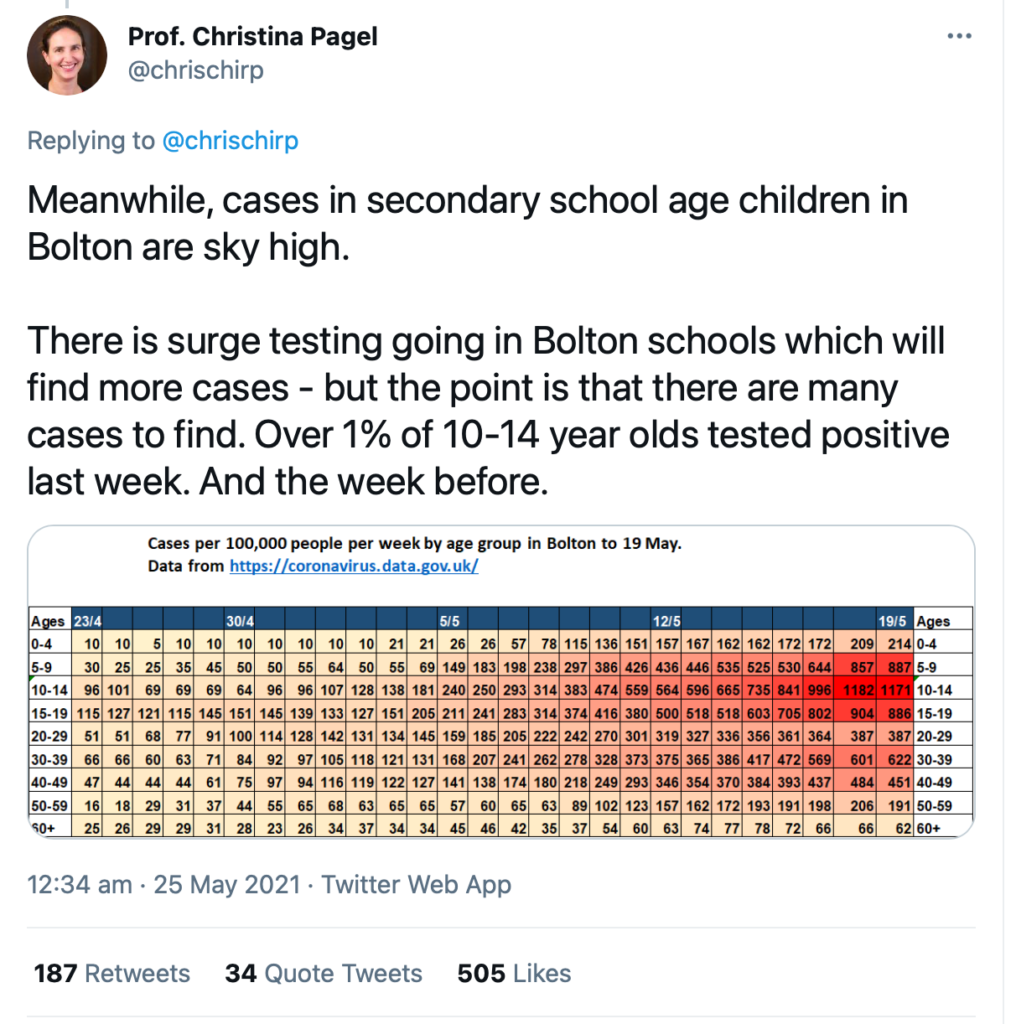
“Cases per 100,000 people per week by age group in Bolton to 19 May”
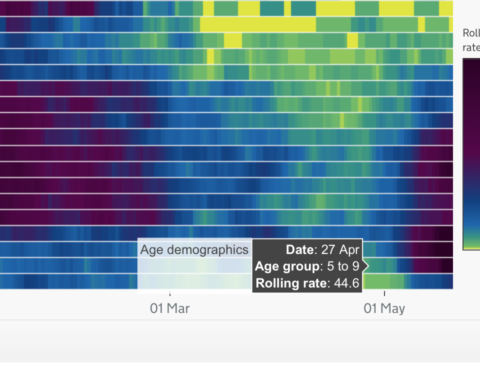
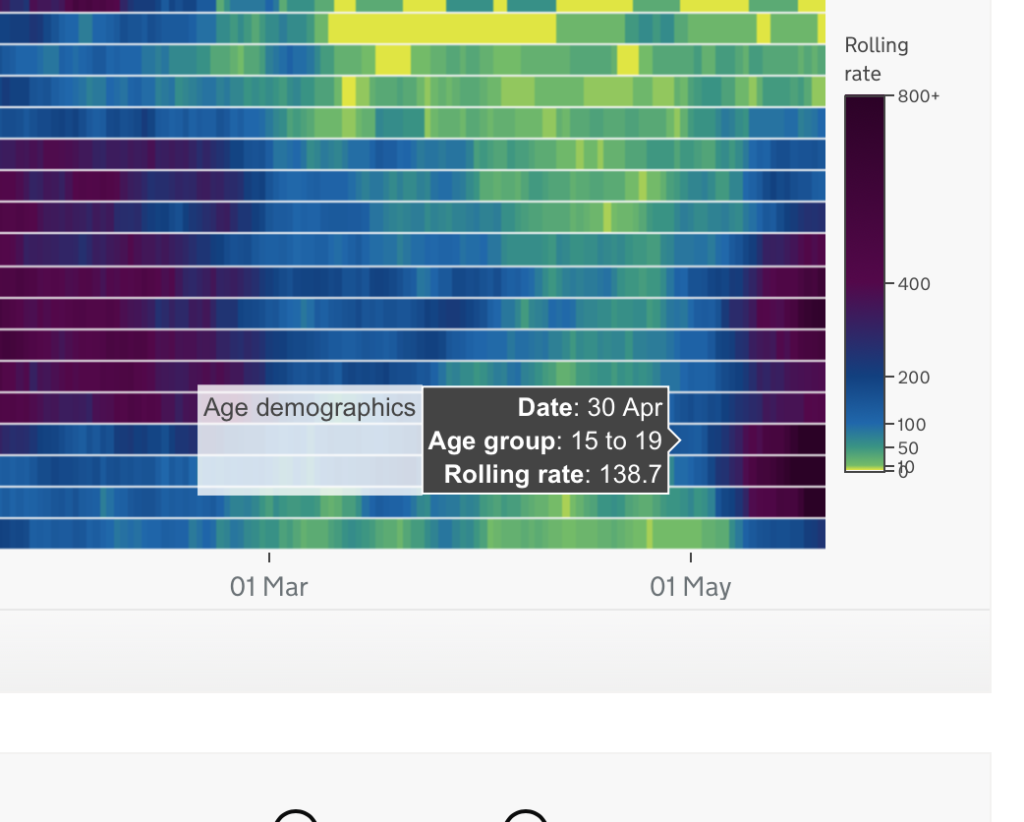
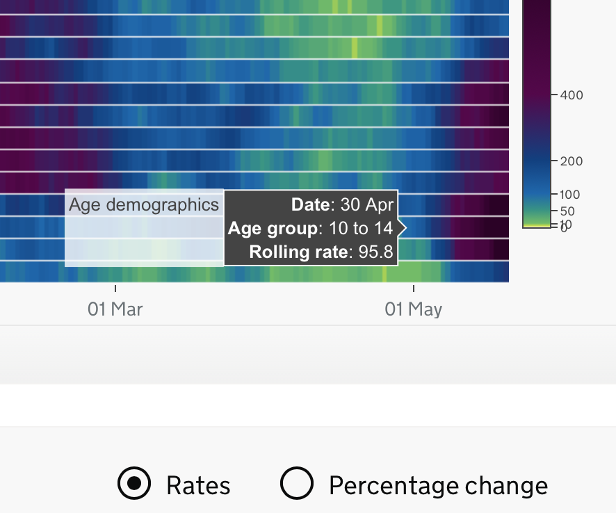
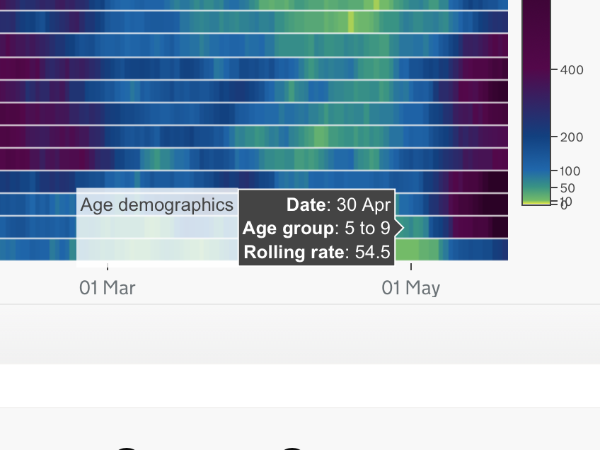
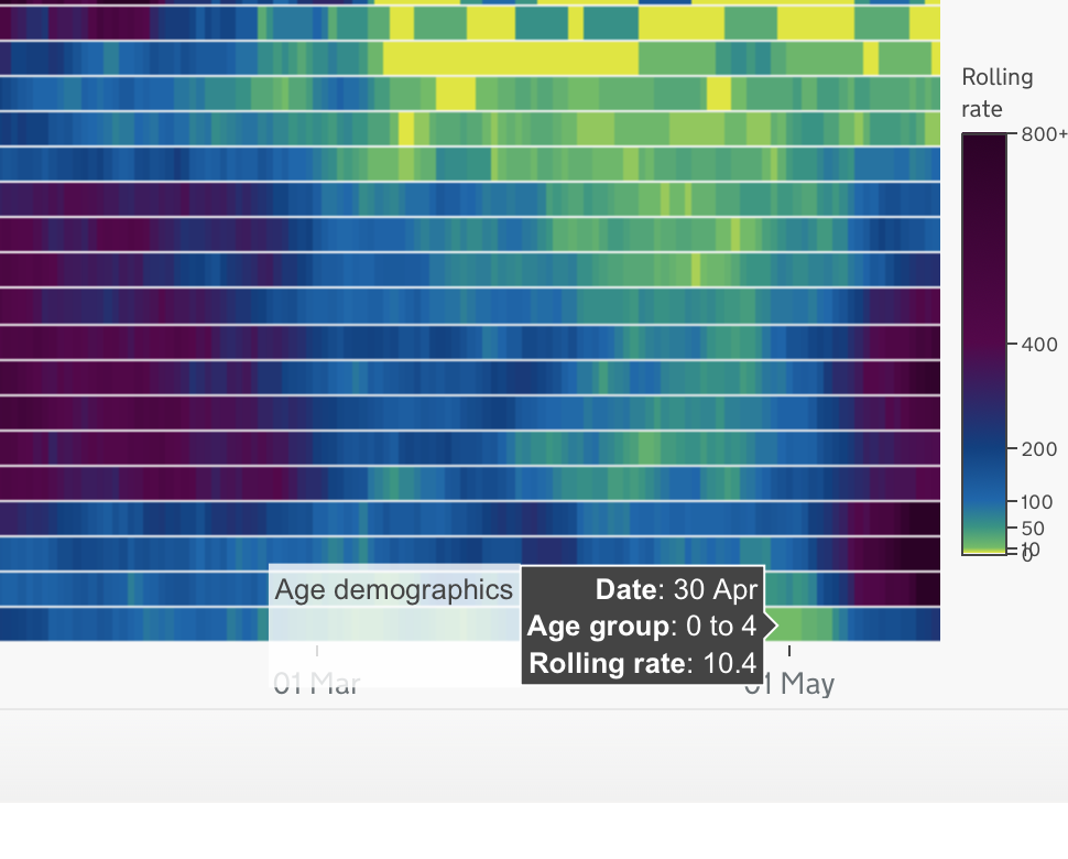
What the graph shows is the “7-Day Rolling Rate per 100K, by age group for Bolton”. But that is not how Pagel labelled it. In presenting the values as she did and labelling the graph in the way she did, it suggested that each cell value represented a week. Indeed Pagel compounded this belief when she misrepresented the data for the 18/5 for 10 to 14 year-olds as being for “the week before” the 19/5.
How do we know that’s what she did?
The cell with the 1,171 value is what Pagel cites as being the 1% for “last week” (19/5). She provides how she established that percentage in this tweet.
So with 1171 = ~1%, she goes on to say that ‘Over 1% also tested positive the week before ‘. The next closest value to 1171 on the 10-14 age cohort data line is from the day before, 18/5 – 1182.

It’s quite clear she was referring to that data point.
However, what also threw me off was an error in the dated cells and incorrect corresponding values. For example, the values added to the chart for the 30/4 don’t correspond to the values from the .gov data for the same date. Therefore quite a bit of the data Chris supplies in her chart is incorrect and wouldn’t be accepted as homework by a Year 7 teacher, let alone by a scientific body.
A few quick examples,

Confused by the 5-day gap (on Pagel’s chart) between 23/4 and 30/4 (should be 7 days) I set out to ascertain which data corresponded with which cells. The 3 slides below from the 27/4 are taken from the .gov dataset used also by Pagel. I have taken 3 age groups and compared their data to that of the presumed 27/4 cell on Chris’ chart.
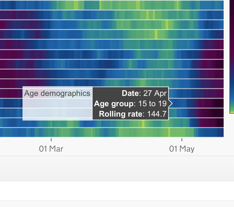
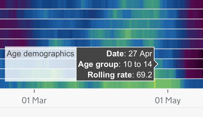
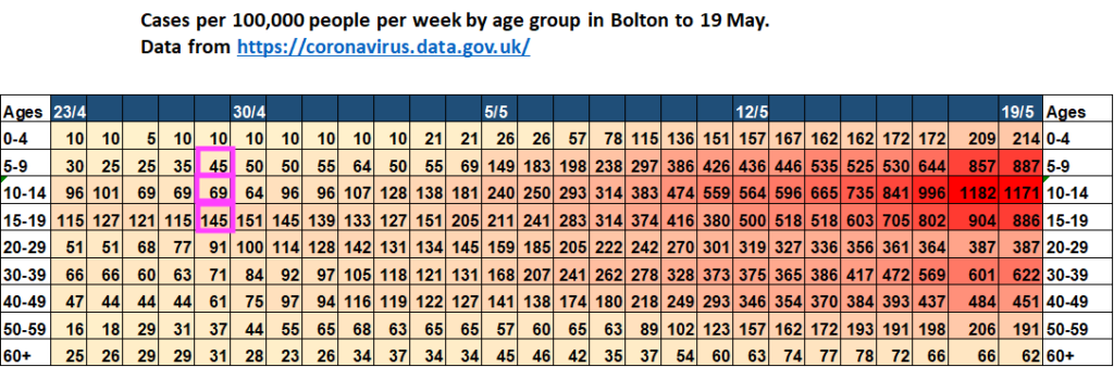
So we have established which line refers to the 27/4. But the following day is the 30th – what happened there? I again wanted to check the reliability of the data for that alleged date.
If we then do the same as above and compare the .gov 30/4 values with Chris’ what do we get?
Pink = Pagel’s 30/4 values
Green = .gov’s 30/4 values
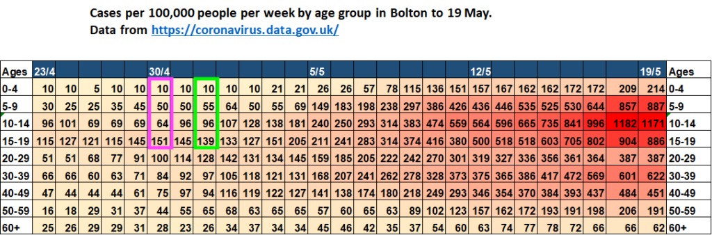
They don’t correspond with the 30/4 on Pagel’s chart but instead show up in cells 2 days later!
I gave up trying to work out what she’d done at this stage but the total of everything – is the chart is junk and unreliable.
I continue…
Again, working from the chart title ‘weekly totals’ and Pagel’s claim that the value in the cell for the 18/5 was also a week’s total I knew that couldn’t be right as the cells are daily cells and there are 7 cells between 12/5 and 19/5. So if the 19/5 represented the previous week then how could the 18th represent the week before that? I then stupidly tried to make sense of Pagel’s misleading tweet and her accompanying chart – that included dating errors and incorrect values.
Based on the information provided by Pagel I made an incorrect leap to assume that as each cell had a daily value and as there was no way each cell represented individual weekly values as claimed then it must have been that the graph title ‘weeks’ was incorrect and instead what she was referring to was daily cases, not weekly.
This lead to me calculating that if 1,171 cases represented 1% of the 10-14 year-olds in Bolton then that would mean the total number of that age cohort (100%) would be 117,100 – which couldn’t be right either as the estimated total population of Bolton is ~285K with an estimated 18K children in that age group. I wasn’t the only one to make that leap.
What gave me further cause for concern was the day before I had documented how her Independent Sage colleague, Kit Yates, had also misrepresented graph data on schools. How could two highly qualified experts from a scientific body get chart data on children so wrong two days in a row? Yet the outcome of both their tweets was the same — a heightening of fear levels around alleged school transmissions.
That is a fair question to ask given the circumstances and at a time when this same group is sounding increasing warnings around schools.
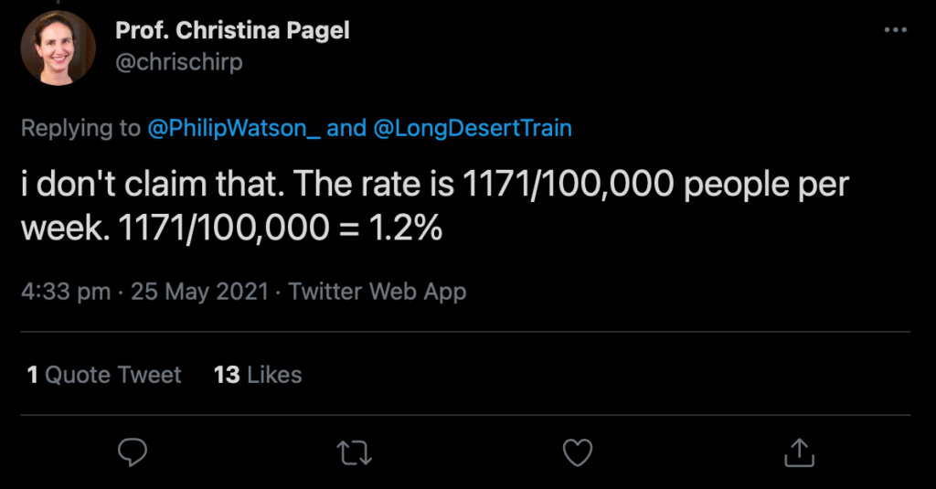
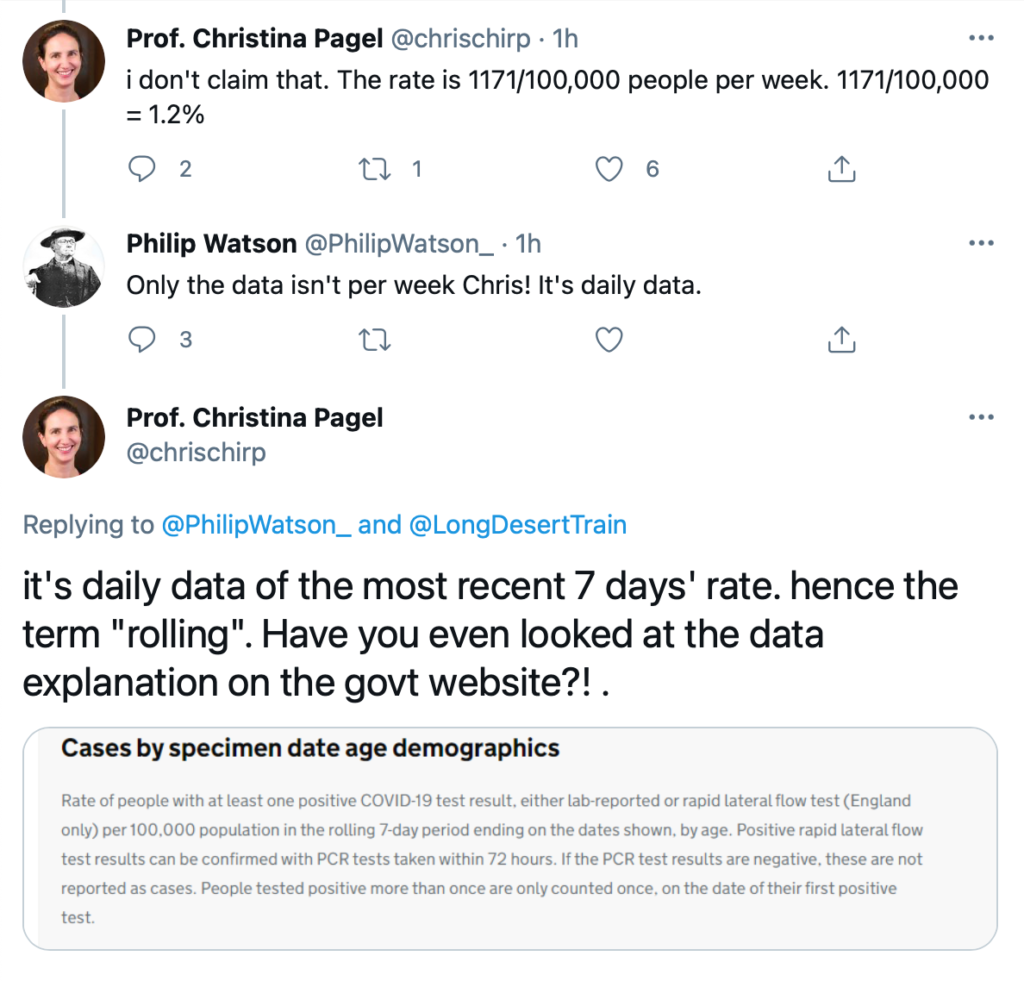
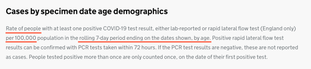
I then followed the link in Pagel’s chart which brought me to the government’s website for COVID-19 data. However, at this stage, I am still focusing on the chart title and looking at “Cases per 100K per week” and not ‘ 7-day rolling averages ‘. Viewing the daily case data wasn’t helping me any as it was contradicting the daily totals in the daily cells in Pagel’s ‘weekly totals’ chart. I then tweeted her pointing out some concerns to which she replied,
She would further clarify,
I did say that. What i didn’t say was that 1171 children had tested positive. I said that the case rate (from the government webiste) was 1171 PER 100,000 population (emphasis added)
Only the “case rate” isn’t and wasn’t “1171 PER 100,000”. But the ‘rolling average’ was! Is there a difference? Yes.
When I called Pagel out on her presentation of the data, only now did she introduce the term “rolling” for the first time.
Case Rates vs Rolling Rates
Case Rates for COVID-19 are recorded as daily rates of confirmed infection per 100K people (or per 1M), on the other hand, Rolling Rates (7-day in this instance) refers to daily entries of the previous 7-day case rate. For example:
- 19/5: 1,171 [refers to data from] 13/5 – 19/5
- 18/5: 1,182 [refers to data from] 12/5 to 18/5
- 17/5: 996 [refers to data from] 11/5 to 17/5 etc…
As per the government website….
Case Rate per 100K is what is displayed in the common line graphs we’ve all been seeing for the past 14 months. Each data point represents that day’s total and over the longer term, these data points give us a trend line.
To summarise; weekly totals are totals that are recorded over the previous week, which is usually Monday – Sunday. 7-day rolling rates are recorded over the previous 7-day period with those 7 days being reset with each new day and a new rolling average provided daily. Both give two different sets of information.
Pagel’s Retracts …. kinda

Rather disingenuous of Pagel to then claim that it is my fault she incorrectly labelled a graph, incorrectly read the cell values of that incorrectly labelled graph, incorrectly dated cells and incorrectly added corresponding values to those incorrectly dated cells, and then failed to grasp the difference between ‘Weekly totals’ and ‘7-day rolling rates averages’.
A simple clarification that the chart represented ‘7-day rolling rates’ and that she had mistakenly taken the cells to represent weekly values would have cleared things up. Indeed, later in the evening, after I sent Pagel the email it would be brought to my attention that she had partially corrected her initial claim that the value for the 18/5 represented “the week before”.
Even some well-intentioned interjection from a Dr also went astray in trying to help Pagel see how her tweet was misleading. Instead, she ignored intervention and decided to conclude that I was wrong anyway.

What this goes a long way to proving is that sections of academia cannot accept they got anything wrong and we see this rolled out daily with ‘expert opinions and predictions’ on COVID-19. I recently reported on another colleague of hers, Trish Greenhalgh, pushing disinformation on national TV. Even after it was established in an email exchange with Trish that she was wrong, instead of apologising, she doubled down on the disinformation with more disinformation.
Take-away

Several points threw me off on this matter. The biggest one being how Chris confused the 18/5 value as representing “the week before” and secondly, the issue with the date cells as this added to concern that the chart was poorly constructed and therefore worth being sceptical of which I soon became. Also missing from the graph title was the fact the cells represented rolling 7-day values. Simply pointing out rolling rate data changes the context entirely and allows one to draw better-informed conclusions from the data. Instead, I incorrectly presumed that Pagel was referring to daily case rates when she wasn’t. In my favour, Pagel actually thought each cell represented weekly totals.
For my part, I have no problem apologising for making presumptions, especially when based upon poorly-worded tweets and a badly flawed chart. Allowing myself to also presume that a member of Independent Sage could at least construct a basic chart is another failing of mine in this instance.
Had Chris acknowledged her errors this would have allowed me to spot where I was going wrong. Instead, she blocked me and partially corrected her mistake behind the block. Very professional.
This chart and her accompanying tweet are junk and should be deleted, redone and then tweeted again. If she is capable of messing up something so basic as replicating, then verifying, a prepared dataset then I cringe at just what else she gets wrong so easily when it comes to relaying data and values to the public. Something we’ll keep an eye on for sure.
I will end with this tweet from Pagel. I don’t believe there’s any doubt on whose maths is at fault here. Worse though, especially when that maths is already prepared and downloadable as a dataset from the government website. It speaks volumes of one’s capability or lack of when you then struggle to apply that dataset to a chart and get it right!